
Overview of data availability and timeliness status
This page provides a summary of the current reception status of the various satellite data sources using a traffic light display overview for data timeliness (top plots) and data numbers (bottom plot), respectively. Results are based on an automated evaluation of both DWD and Met Office data availability monitoring systems. Details regarding the contents of the overview plots are given at the bottom of the page.

|
|

|
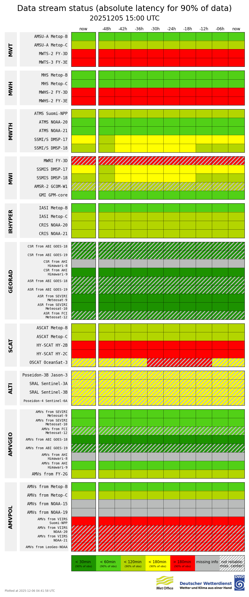
Each of the plots shows status at six hour intervals from -48hours until “now” (the time plot is generated) for each instrument providing data for a given data type (Microwwave Temperature, Microwave Humidity etc.)
Further details
As a basis for these overviews, the number of data received as well as their timeliness are checked every 6h for the data batch that arrived during the previous 24h period (consistent with the 24h pdf’s of delays on the Data Timeliness page). The data numbers and their timeliness are automatically compared to expected values. These expected data numbers and delays are instrument specific and based on statistics derived from long time series, covering several months, excluding severely delayed data in the computation of the expected delay statistics. For determining an instrument’s ‘data stream status’ the checks are done on both the DWD and the MetOffice data reception monitoring results and statistics. In the diagrams ‘Latency’ (top left panel) and ‘Number of observations’ (bottom left panel), the status alerts are set if both systems indicate a drop in data numbers or a change in timeliness relative to their longer term time series. The aim of these plots is to flag potential current issues in the data dissemination. Additionally, the diagram ‘absolute latency’ (top right panel) compares the current data latency to fixed timeliness thresholds indicated in the plot legend. The used current data latency in this plot is the lower latency of either DWD or MetOffice timeliness values of the last 24h batch.
The timeliness indicator used in the latency diagram is the time at which 90% of data have entered the data base.
Results are updated every 6h and the checks done over the previous two days are included in the overviews. The colours from green to red are assigned as follows:
Plot ‘Number of observations’: colours indicate data numbers within 75-100%, 50-75%, 25-50%, less than 25% of the usual data numbers
Plot ‘Relative latency’: coloured categories are for increases in data latency of <25%, >25%, >50%, >75%, >100% of the latency for 90% of data for that data type;
Plot ‘Absolute latency’: colours indicate latency within fixed timeliness thresholds of 30 min, 60min, 120 min, 180 min, >180 min., respectively, for 90% of the data received from the respective instrument data set.
If results of only one centre’s monitoring were available for a certain instrument data set, the results are considered less reliable (in terms of indicating data dissemination issues) and this is indicated by grey hatching in the plots.
More details on the availability and timeliness of the individual data types can be found on the plots provided on the Data Coverage and Data Timeliness pages.